
TYPOGRAPHY
my first course of the semester.
my first course in Srishti.
my first encounter with...typography
i had never been more nervous...
i had begun the process of unlearning any rubbish that i filled my head with...
i had already begun breaking down the misconceptions about typo being tough...you see...i wanted to be there, physically, mentally with an Open Mind.
the course took its course..
kruti saraiya, our course faculty, introduced us to our assignments which was to design door tags for various target groups...conditions were laid - such as we could ONLY use Helvetica, in its finest and purest form...NO colour...which in the beginning i thought would be boring, but there was a lot to discover in b/w.
we also had to come up with our own body text - the text that we would work with...it was almost like we were in a writing course, because the process of coming up with matter went through a lot of back and forth's !
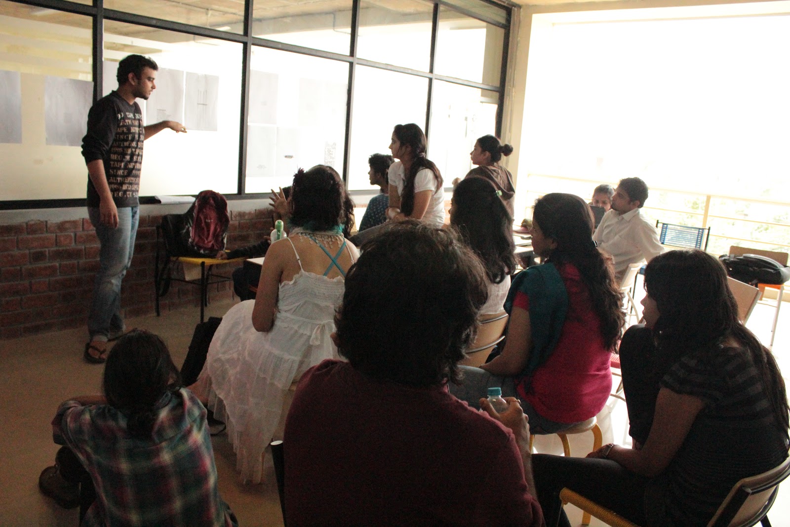
we had weekly crit sessions, where we put up all our work on the glass panes and painstakingly went through each persons work and took turns to feedback it....this is where i had a lot of trouble, because what seemed right to me would actually be just the opposite...it would happen so often that kruti told me, "whatever your thinking, say the opposite"! which was funny, but on some level i began to question if i was really understanding anything at all... i tried not to be too harsh on myself, and just went along with things.
at the end of the course i saw some very brilliant work produced by my peers, i learnt some basics, i still have plenty doubts and apprehensions...but i think typography just like anything else is all about practice and using your eye.
here are some of the final door tags from this course.
 |
| To design a door tag for a scientist, keep it vanilla...plain, simple typography. |
 |
| A door tag for an auto driver |
 |
| this was our last assignment, to make a door tag for ourselves |
 |
| crit session |
 |
| late night printing and cutting of final submissions |
LAYOUT AND COMPOSTION
Layout and Composition was our second core course. Having done my visual communication before helped to a small extent that some terms were familiar. We were taken through a series of exercises where we had to make compositions using different forms (such as circles, lines, triangles) based on the concepts of distance, proximity, progressive separation, rhythm, movement alignment etc. We discussed our exercises as a class and sometimes one on one with Sonalee Mandke, our course facilitator. There was a particular turning point for me in this course where i had this fear of grids. I was building a wall against this. Until one day we had a class exercise dealing with grids - it simplified it and made it more fun..this fuelled my interest further and i opted to do my final experiment for the course on grids.
The hypothesis was :
To understand if grids inspired by anything that surround us, can communicate an essence of what they are inspired from. This is a link of the entire document if you are interested in going through -
http://issuu.com/shruti0488/docs/layoutexperiment
ILLUSTRATION FOR COMMUNICATION
The shortest core course of this semester under Rustam Vania. Was eye opening, especially because i thought illustration is relatively simple...little did i know. We were taken through a process where we had to pick words and quickly illustrate over 20 concepts and then see a single strong working idea till the end. We didn't focus on mastering mediums at this stage but focused more on coming up with quirky, strong concepts...paying attention to our lines. The course was way too short for me to assess myself. I do however know that i need to work a lot on my lines and right now i am pretty stiff...and need to break free from the usual and really go mad.
Some of the stuff that came out of the course :

 |
| i had to sketch different forms of the ostrich. |
 |
| illustrating the word "bend" |
 |
| illustrate the phrase - the ostrich egg yolk is the largest in the world |
IMAGE AND TEXT
Image and text was a general studies course which teaches a skill...in this case i was learning Adobe Indesign. I had kept hearing that it is very similar to Illustrator, in many ways it is, but Indesign is mostly for publication design. How much this course would and is helping me currently is unimaginable. Contrary to what i've done in my previous education, the prospect of learning a software comes along with the task of using it immediately in designing an output. This was to test if we really understood the software or not.
The objective was to design a book or magazine by the end of the few months. I had figured out my concept and wanted to really go mad with the book, so i spent A LOT of time on my concept. But Wasim, who was the course facilitator didn't care much for the idea, but stressed more on execution. My idea was knocked down. And so was my morale, until i decided that i cant always do what i want and decided to go with Wasim's advice. I picked up a simple concept of deigning a book of the 11 top songs of all time according to Rolling Stone Magazines longer list of 500 top songs. The book had different layouts for every artist and the lyrics on one side of the spread and a little blurb, all this would be sorrounded with pictures of the band or artist. Here is the final result :
http://issuu.com/shruti0488/docs/11greatsongs
INTERIM COURSE
The interim course is supposed to be a relatively less stressing out course. I took up this course called the MAOS 2 or the Mobile Aural Obeservation Station part 2. A sound artist Cathy Lane and a textile artist Tessa Brown collaborated to help us create sound and textile installations in a select part of Bangalore for aural reverie. For more details on what and how things happened...click on the links below. Here are some pictures of the structures we built at the end of the course.
https://www.facebook.com/media/set/?set=a.10150451545228744.383659.507698743&type=1&l=0d16cab10e
http://www.tumblr.com/blog/aavaaz
http://www.tumblr.com/blog/maos2bengaluru2011
No comments:
Post a Comment